Layout representation for Relativity forms
The Relativity Forms API supports a specific layout structure for forms that enables client-side event handlers to interact with different components. This page contains an overview of the layout structure and highlights different components in it.
This page contains the following information:
Layout structure overview
The following diagram illustrates the layout structure for forms supported by the Relativity Forms API.
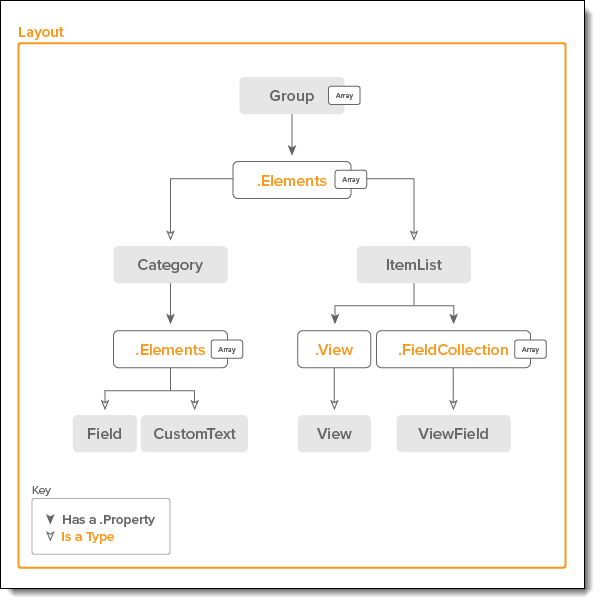
Summary of Layout components
The following table lists each of the components in a Relativity page layout.
|
Type |
Description |
|---|---|
|
An array of Groups. |
|
|
A Group of Categories and Item Lists. |
|
|
A Group of Field and CustomText components. |
|
|
A representation of a Relativity Field within a Layout. |
|
|
A representation of user-defined static text. |
|
|
A representation of a Relativity ItemList related to a multiple object association. |
|
|
A representation of a Relativity View. |
|
|
A representation of a Relativity ViewField. |
JSON data contracts
This section includes a list of the JSON data contracts used by components in the layout for Relativity forms.
Group
A group represents a collection of Categories and Item Lists that.
Note: If the Elements array contains multiple items, the items are treated as tabs.
|
Property |
Type |
Description |
|---|---|---|
|
GroupID |
Number |
The identifier of the group. |
|
TabbedDisplay |
String |
A string containing a comma separated list of modes. When the layout is in any of the modes listed, all categories in Elements will be displayed as tabs. If the layout is in a mode not listed, each category will be displayed on a separate line. Supported values: View, Edit, View, Edit. |
|
Elements |
Array<Category|ItemList> |
An ordered array of items that are shown in the group. |
Category
A collection of Fields/Custom Text components and or an Item List.
|
Property |
Type |
Description |
|---|---|---|
|
CategoryID |
Number |
The identifier of the category. |
|
Collapsible |
Boolean |
If true, the category is collapsible. |
|
ContextualHelp |
String |
The text that should be displayed in the contextual help tool-tip that appears when hovering over the icon in the category. The icon will only be visible if there is a value for ContextualHelp. |
|
DefaultCollapsed |
Boolean |
If true, the category should be collapsed by default. |
|
Title |
String |
The title of the category. |
|
Elements |
Array<Field> |
An ordered array of the fields in the category. |
|
IsViewModeOnly |
Booelan |
If true, the category should only be visible when a form is in view mode. |
|
View |
View |
The view of the item list associated with the category. |
Field
A representation of a Relativity Field within a Layout.
Note: Additional properties are field type-specific and may not be explicitly documented.
|
Property |
Type |
Description |
|---|---|---|
|
Row |
Number |
Vertical position within a Category. Row numbers start at 1. Higher numbers indicate that the field should be positioned further down the page. |
|
Column |
Number |
Horizontal position within a Category. Column numbers start at 1. Higher numbers indicate that the field should be positioned further to the right. |
|
Colspan |
Number |
The number of columns consumed by an element. |
|
FieldID |
Number | String |
The identifier of the field. This is usually a number, but it can also be a string. |
|
FieldType |
String |
Field types include: { Currency, Date, Decimal, FixedLengthText, LongText, MultipleChoice, MultipleObject, SingleChoice, SingleObject, WholeNumber, User, YesNo} |
|
DisplayName |
String |
The user-friendly name displayed in labels unless a NameValue is set. |
|
IsRequired |
Boolean |
If true, the field requires a value for a save to be considered valid. |
|
IsReadOnly |
Boolean |
If true, the field should not be editable. |
|
IsSystem |
Boolean |
If true, the field is a system field. |
|
AllowCopyFromPrevious |
Boolean |
Not implemented in the current version. |
|
ShowNameColumn |
Boolean |
If true, the label should be visible on the field. |
|
DisableLink |
Boolean |
Only relevant to SingleObject fields. If the property is absent or false, a link is displayed, unless the type is Search or the value is secured. |
|
RepeatColumn |
Number |
Represents the count of columns used to display values for radio and checkbox fields. |
|
DisplayType |
String |
Display types include: {Checkbox, Dropdown, InlineRichText, List, Picker, PopupRichText, Text}. The DisplayType is specific to each FieldType. |
|
PickerViewArtifactID |
Number |
The artifact Id of the view that is associated with the picker for the field. Used for SingleObject/MultipleObject fields. |
|
FieldCategoryID |
Number |
Used to categorize the field, such as identifying the parent field. |
|
NameValue |
String |
A markup supported property that overrides the label set from the DisplayName property. |
|
Extension.AllowManage |
Boolean |
Adds a button to allow users to modify associated choices in the form. Only for SingleChoice and MultipleChoice fields. |
|
Extension.AllowAdd |
Boolean |
Adds a button to allow users to create new associated objects in the form. Only for SingleObject and MultipleObject fields. |
|
Extension.CanViewObjectType |
Boolean |
This is one of several factors that lead to to SingleObject field disablement. For reliable SingleObject disablement use FieldHelper API during the LAYOUT_COMPLETE or later stage. |
|
Extension.CanViewObjectTypePickerView |
Boolean |
This is one of several factors that lead to to SingleObject field disablement. For reliable SingleObject disablement use FieldHelper API during the LAYOUT_COMPLETE or later stage. |
|
Extension.EstimatedChoicesCount |
Number |
An optional property that is used to pre-populate loading styles for choice fields. Only for SingleChoice and MultipleChoice fields. |
|
Extension.IdentifierFieldName |
String |
The field name of the field on the single/multi objects to display the value of the object in the form. Only for SingleObject and MultipleObject fields. |
|
RemoveNoValueChoice |
Boolean |
If true, the field will not have the ability to select no-value. Only for Boolean fields. |
|
SortOptions |
Boolean |
(Optional. Defaults to true) Whether or not the values should appear sorted. Applies to non-boolean fields with "Dropdown" Display Type. Note that the default data providers for these fields return pre-sorted values, so this value is most visible when using a data source override for the field. |
CustomText
A representation of user-defined static text that occurs at the same level as Field.
|
Property |
Type |
Description |
|---|---|---|
|
Row |
Number |
Vertical position within a Category. |
|
Column |
Number |
Horizontal position within a Category. |
|
Colspan |
Number |
The number of columns consumed by an element. |
|
ID |
Number |
The identifier of the custom text. |
|
Value |
String |
The text that is shown for the custom text. |
ItemList
A representation of a Relativity ItemList related to a multiple object association.
|
Property |
Type |
Description |
|---|---|---|
|
workspaceId |
Number |
The workspace where the items in the list are located. |
|
FieldCollection |
Array<ViewField> |
An array of all the ViewFields that are displayed in the view. |
|
View |
View |
The view associated with the Item List. |
|
ViewID |
String|Number |
The Identifier given to the view. Only used for static object types that do not have standard views. |
View
A representation of a Relativity View.
|
Property |
Type |
Description |
|---|---|---|
|
Name |
String |
The name of the list that is shown at the top. |
|
ArtifactID |
Number |
The Relativity artifact id of the view. |
|
Guids |
Array<String> |
An array of associated GUIDs which are used for the View. |
|
FieldArtifactID |
Number |
The artifact id of the field for which the List is displayed. A zero is used 0 for lists displayed for child objects. |
|
ObjectTypeID |
Number |
The artifact type id of the items in the View. It is also referred to as the descriptor artifact type id in Relativity ObjectType tables. |
|
ConnectorFieldArtifactID |
Number |
Represents the artifact id of a connector field that links the object type in the list to object type in form. A multiple object is used for an associated list, and a single object is used for child lists. |
|
FieldIds |
Array<Number> |
The artifact ids of the fields that are associated with the view. |
|
RenderLinks |
Boolean |
If true, cells with links to other object types should be clickable in the list. If false, cells should be rendered as plain text. |
|
LinkViewID |
Number |
Optional property that represents the artifact id of the view to use that takes precedence over ArtifactID. |
|
FieldCategoryID |
Number |
The field category identifier of the field that is associated with the item list. A value of 11 represents a child list, which is the most common usage. |
| FieldsIds | Array<Number> | An array of AvfIDs of all fields in this view. If this View contains a ViewField with an AvfID not in this array, it will not display properly. |
ViewField
A representation of a Relativity field shown as a column in a View.
|
Property |
Type |
Description |
||
|---|---|---|---|---|
|
AllowHtml |
Boolean |
If true, the column will render HTML values. If false, it will display the values as plain text. |
||
|
ArtifactID |
Number |
The Relativity Artifact ID of the Relativity field that this column will display. |
||
|
AssociativeObjectTypeID |
Number |
The artifact type Id of the object type the Relativity field is associated with. The value is 0 if the field is on the object type related to the view. For example, for single and multi-object fields, AssociativeObjectTypeID is non-zero, but for fixed-length text and number fields, AssociativeObjectTypeID is 0. |
||
|
AvfID |
Number |
An identifier for this ViewField. This must be unique. This is usually the Relativity Artifact View Field ID of this field, but it can be anything you'd like as long as it's contained in this ViewField's associated View's FieldsIds array. Note: This is not used as the identifier for this column when displaying data. Use HeaderName to specify the identifier for this column. |
||
| CustomModalHandler | Function |
modalOpenerConfig - is the config which is passed to the modal handler. Can be used to override focus actions on the element. modalOpenerConfig.preventDefaultRefocus - if set to true will not focus the edit button after the modal is closed. If ViewField is a Single Object, the display type is Picker and a function is set on the customModalHandler property when the select button is clicked the customModalHandler function will be called instead of opening the default single list picker modal. The customModalHandler function can contain the logic for opening any custom modal and setting the value for the field. Setting the value within Event Handlers should be handled through the convenience API:
|
||
|
FalseValue |
String |
The value that will be shown for false boolean values in a list cell. |
||
|
FieldTypeID |
Number |
A value representing the type of data the Relativity Field associated with this column contains. This controls how the data will be displayed in item lists. See the Field Type ID enum for a list of possible values. |
||
|
FilterType |
String |
The identifier of the filter type by the Filter Type enum value. |
||
|
FormatString |
String |
Note: Only used for columns with a FieldTypeID of DATE. Ignored otherwise. A string describing how to format the data in this column if its FieldTypeID is DATE. Refer to Date Formats for more information. |
||
|
Guids |
Array<String> |
Read Only property that is used to get the GUIDs associated with the column field. |
||
|
HeaderName |
String |
The identifier of the column that will be rendered in the column header in the list. For example, if a View contains exactly one column with a HeaderName set to "Some Column Name":
|
||
|
IsFilterable |
Boolean |
If true, the column can be filtered. |
||
|
IsLinked |
Boolean |
If true, the column values should be clickable. A click on the column value should let the user view the linked object. |
||
|
IsReflected |
Boolean |
If true, the column is a reflected field. |
||
|
IsSortable |
Boolean |
If true, the column can be sorted. |
||
|
IsSystem |
Boolean |
If true, the column is a system field. |
||
|
ItemListType |
String |
The identifier of the column formatting by the Item List Type enum value. |
||
|
MaxLength |
Number |
The maximum length of column content before values are truncated. MaxLength has to be greater than or equal to 4. |
||
|
StaticText |
String |
A static value that will be shown in each row of the field column. |
||
|
TrueValue |
String |
The value that will be shown for true boolean values in a list cell. |
||
|
Width |
String |
The initial column width. A value of "1000" indicates a column width of 1000px. A value of "" indicates to automatically size the column. The default value is "" |
||
|
Wrapping |
Boolean |
Determines if the column values should be able to wrap lines. |
